Metropolis Bank
-
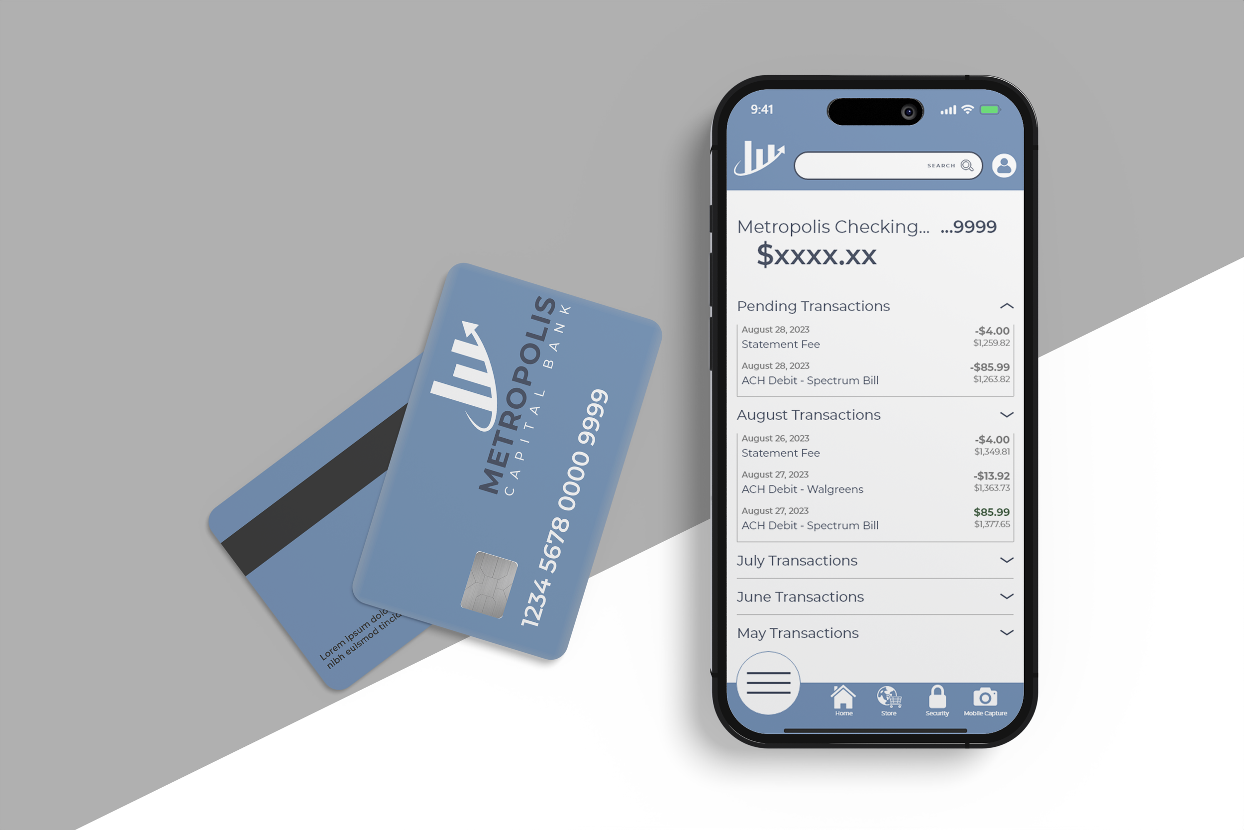
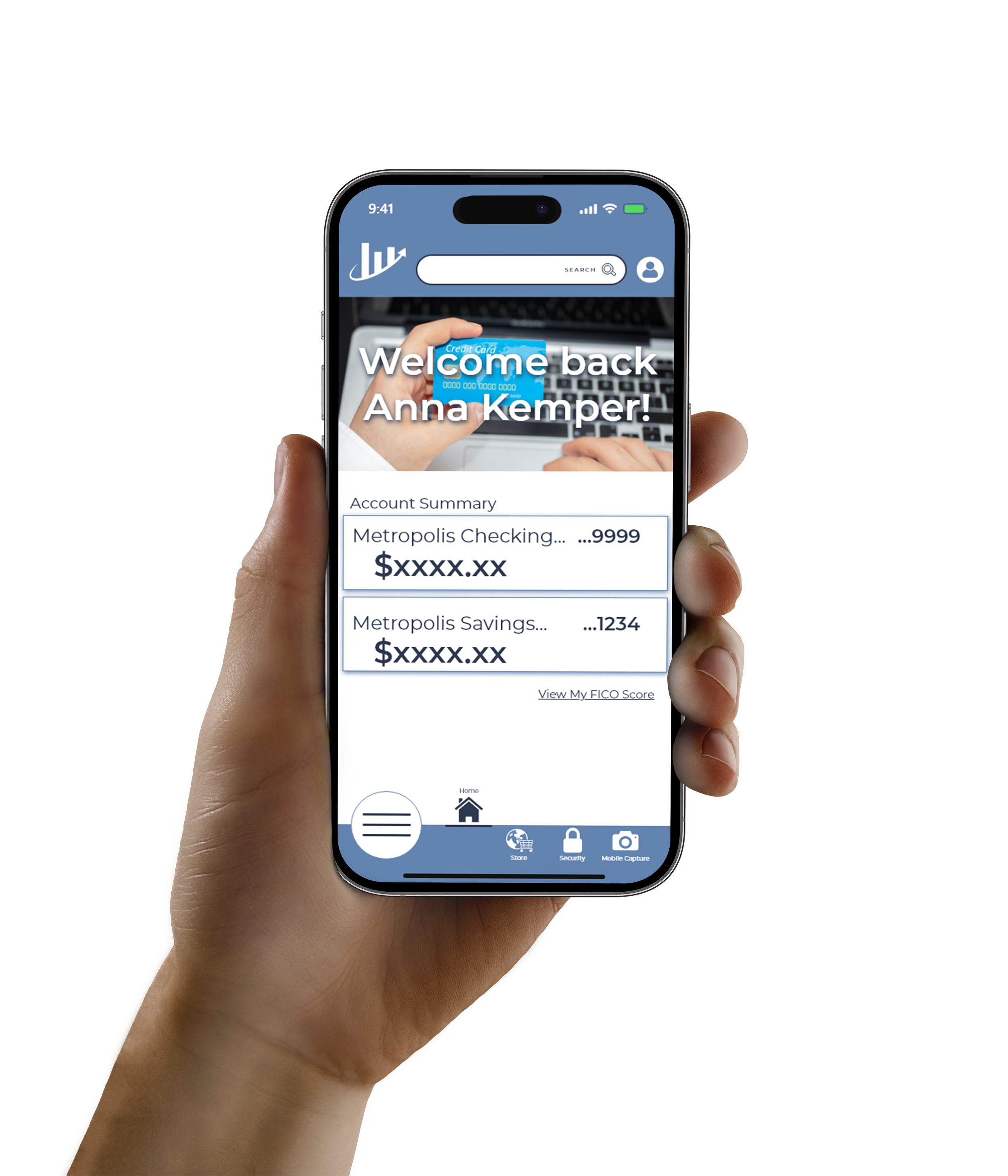
I took on the role of UX Designer and UX Researcher for Metropolis Bank. To stay modern and provide their loyal customers mobile access to their bank details, a mobile application was developed.
-
Metropolis Bank has more than 20,000 members and has a mission of helping its members manage financial matters, accepting all challenges and responsibilities as their own.
-
The stakeholders were concerned an app that did not meet the member’s basic needs would deter client loyalty. They needed to introduce a product that would modernize their capabilities without complicating their perception as being a reliable banking service. They hoped to retain clients, but also sought to expand their member count by offering this new feature.
-
The project would be deemed successful if the site managed to increase its membership by 3% within the six fiscal months of the application’s launch.
Process
Making the transition to a digital experience was uncharted territory for Metropolis Bank. This meant my role was also to provide comfort and knowledge throughout the design process to put their stresses at ease. I explained that developing personas would help them to better understand their consumers for more than just this project. These conversations led to connecting me with their customers for interviews and provided statistical data I was able to compare to area demographics.
I learned that research is essential and proves that expectations are not always accurate. I assumed that the clear visibility of balance details would be most important, but that was only a portion of the feedback received.
User Research
Findings
The most prominent discovery was that members wanted a simplified and reliable way to contact the bank for customer concerns and support. The biggest problem that existed was feeling stuck on a hold line to speak directly with an associate since the bank did not provide a customer service hotline.
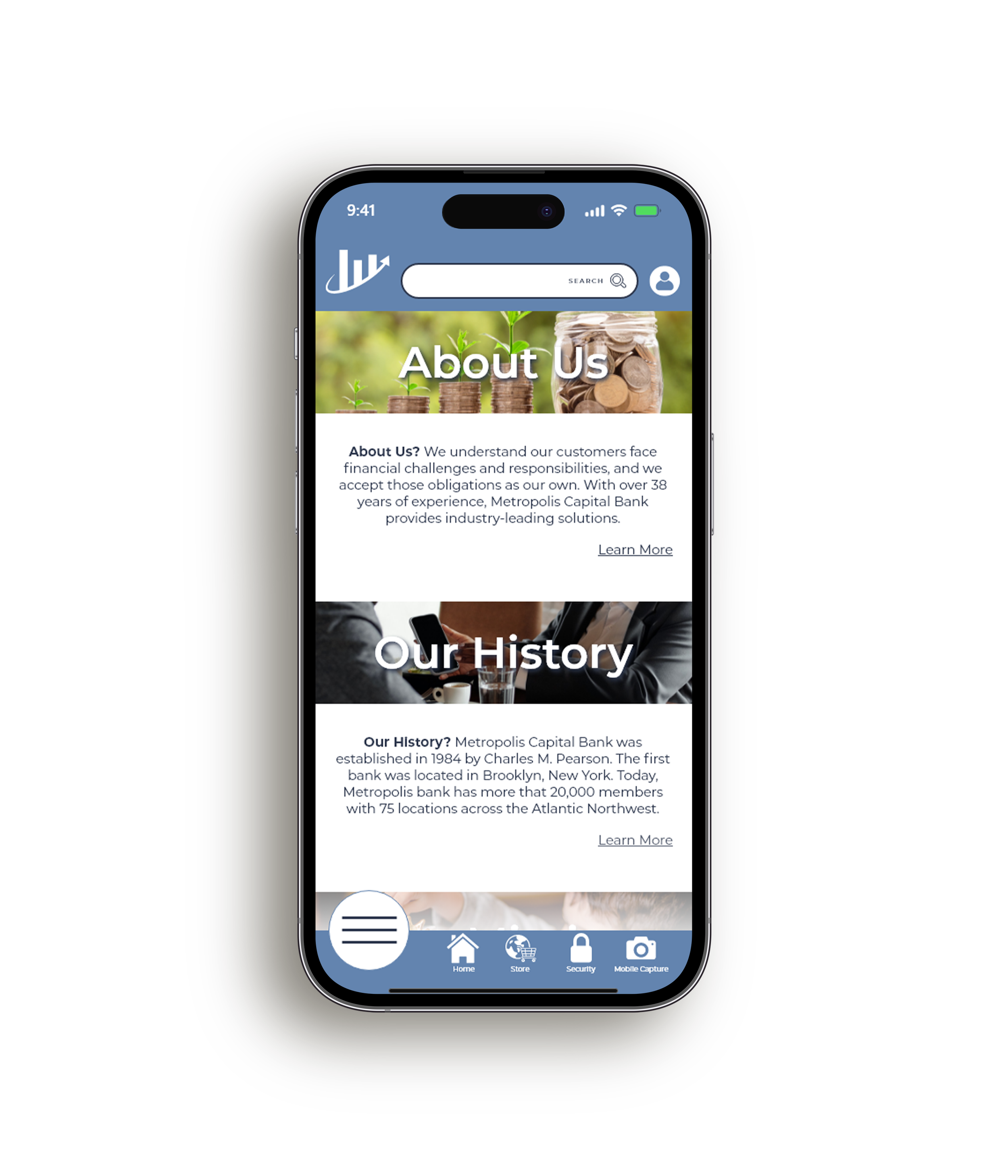
An additionally important finding discovered through interviews with non-members revealed that users would only join a bank if they believed they could trust the service. Many expressed that they want to learn more about a bank and desired to have information about the bank easily available.
Journey Map
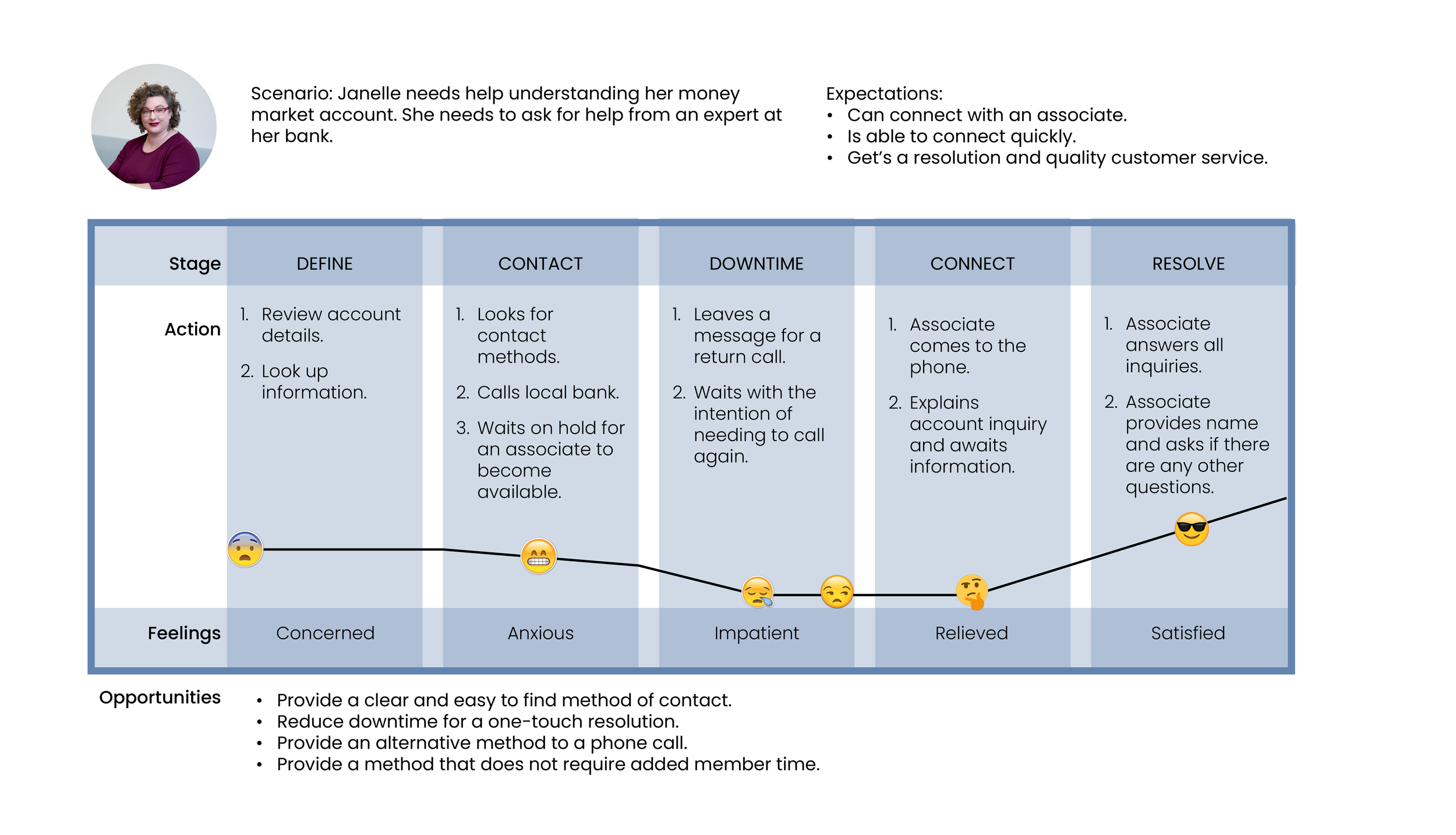
Based on personas and the information provided during interviews, journey maps were established to help understand what opportunities existed to maximize the final product. Several discoveries were uncovered.
Without an app, the members were wasting time looking up information and contact details.
Users could leave a message but did not receive a confirmation nor did they receive a timeframe for a response to ensure they would be available for a return call.
Users became impatient due to the obligation of staying connected to a call and not necessarily because they needed an urgent response.
Lastly, users prefer convenience rather than an added task of asking for support.
Wireframing and Design
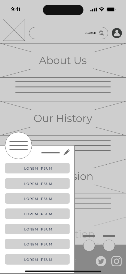
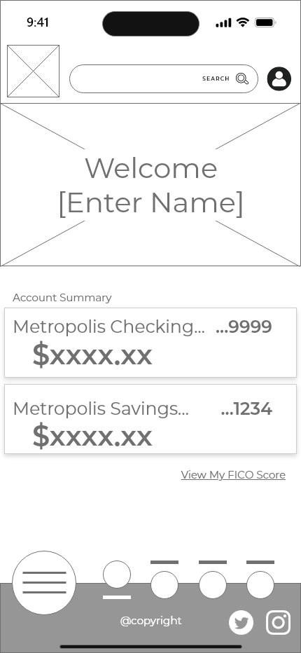
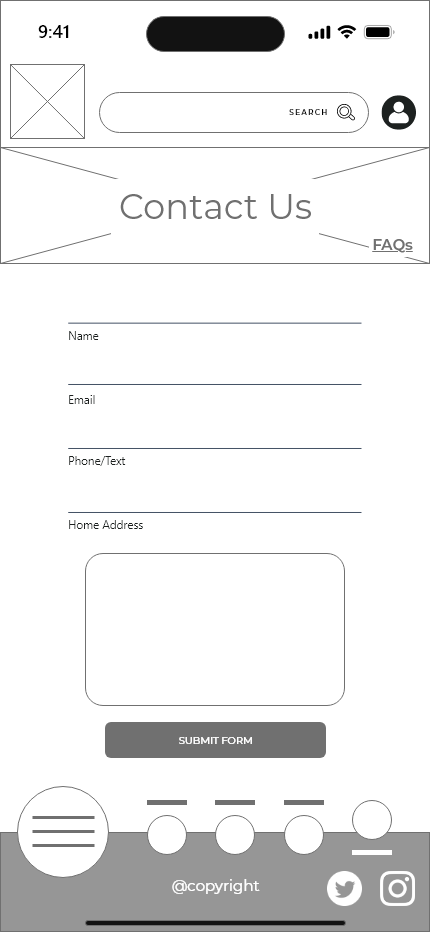
For this project, I rough sketched wireframes and a site map side-by-side. This process allowed me to be methodical about my wireframes so that I did not get caught up in the excitement of creating too early. Through trial and error, I finally developed a process that was simplified and easy to navigate.
This particular process opened my eyes to wireframing inefficiencies. My first design was not my last, and while the sketching I completed supported the process, I spent a lot of time trying to maximize a first iteration.
The most challenging part of this step in the process was satisfying the stakeholder’s desire to utilize the professional snapshots they provided. I approached my competitor analysis by particularly targeting photo usage on applications that hold a person’s essential and personal information, such as other banks. I found that images were not common, nor a were they proven to be a necessity. This was not proof enough that I would be unable to use their images. I found that other applications that provide customer service use imagery to build trust and establish a vision. Ultimately, I used the photos in a strategic and limited capacity which provided the client for return on their asset investment.
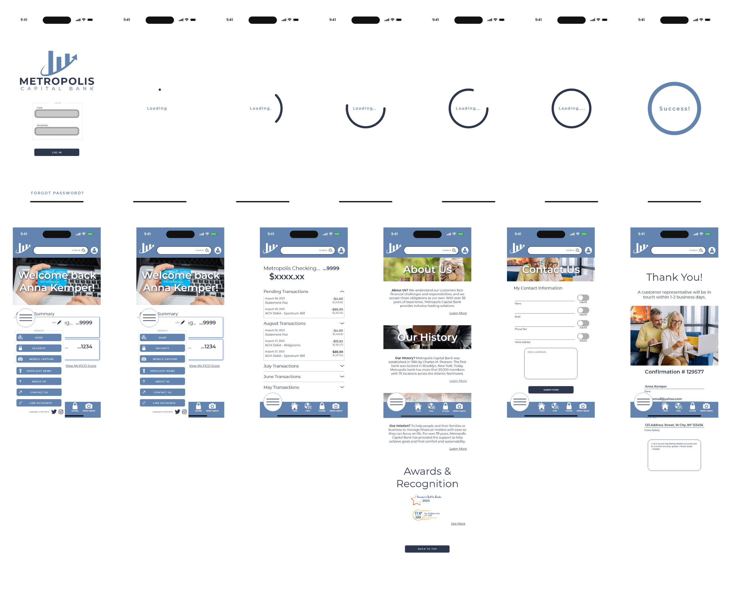
The low-fi to high-fi process was unique because every page was presented and finalized individually before proceeding to the next, creating a stacking order for the final mock-up. This was helpful to build consistency and clean up the assets and components for reference but presented a challenge when the proceeding pages resulted in a revision.
